To view the qmd, click here.
Makeover Monday is a weekly data visualization challenge where individuals and groups reimagine and improve existing charts and graphs to make them more effective and informative, each week a chart or graph is provided along with the dataset. This week’s Makeover Monday graph can be found here.
unemployment_pivot |>
  mutate(region = recode_regions(region),
         region = fct_recode(region, "World" = "world")) |>
  filter(year > 2014) |>
  ggplot(aes(x = year, y = unemployment_rate, fill = region, color = region)) +
  geom_area(stat = "identity", alpha = .90) +
  geom_line() +
  facet_wrap(~region) +
  scale_x_continuous(breaks=seq(2015, 2025, 2)) +
  scale_y_continuous(labels = label_percent(scale = 1),
                     breaks = seq(0, 10, 2)) +
  theme_fivethirtyeight() +
  theme(panel.spacing = unit(1.25, "lines"),
        panel.background = element_rect(fill = NA),
        plot.background = element_rect(fill = NA),
        plot.margin = margin(0, 0, 0, 0),
        axis.text.x = element_text(size = 9),
        axis.text.y = element_text(size = 9),
        panel.grid.major = element_line(color = "grey96"),
        legend.position = "none") +
  labs(
    title = "Unemployment Rate of Regions for Years 2014-2024"
  ) +
  transition_reveal(year)
This plot uses an area graph to represent the unemployment rate over time for each region. Each region is color-coded, and the x-axis represents the years, while the y-axis shows the unemployment rate, ranging from 0% to 10%. The plot transitions through time, gradually revealing the unemployment rates for each region. Faceting by region makes it easier to focus on individual trends and discourages direct comparisons between regions without understanding their underlying distributions.
unemployment_pivot |>
  filter(region != "world") |>
  mutate(region = recode_regions(region)) |>
  ggplot(aes(x = year, y = region, fill = unemployment_rate)) +
  geom_tile(color = "white") +
  scale_fill_distiller(direction = 1,
                       labels = label_percent(scale = 1)) +
  theme_fivethirtyeight() +
  theme(
  panel.background = element_rect(fill = NA),
  plot.background = element_rect(fill = NA),
  legend.background = element_rect(fill = NA),
  plot.margin = margin(0, 0, 0, 0),
  plot.title = element_text(size = 15)) +
  labs(
    title = "Unemployment Rate Over Time by Region",
    fill = "Unemployment Rate")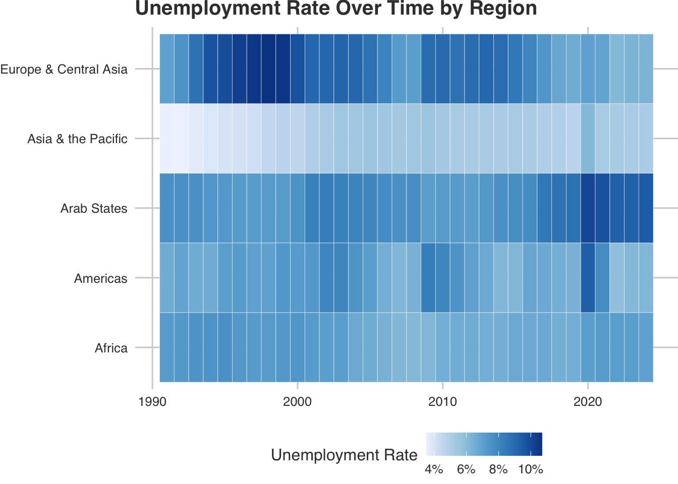
Another way to visualize this data is with a heatmap, the benefits of doing this is it makes it easy to quickly spot trends and outliers across time and regions. For instance, periods of higher unemployment across many regions will appear darker, while improvements will lighten the grid. The x-axis represents the year, while the y-axis shows different regions. Each tile reflects the unemployment rate, darker shades indicate higher rates, and lighter shades indicate lower rates. The unemployment rate in this visualization ranges from approximately 4% to 10%.
target_year_plot <- function(selected_year) {
  unemployment_pivot |>
  filter(region != "world",
         year == selected_year) |>
  mutate(region = recode_regions(region),
         distance = unemployment_rate - 3) |>
  ggplot(aes(y = reorder(region, unemployment_rate), x = unemployment_rate)) +
  geom_segment(aes(yend = region, x = 03, xend = unemployment_rate), color = "grey10") +
  geom_point(aes(color = distance), size = 4) +
  geom_vline(xintercept = 3, linetype = "dashed", color = "grey55") +
  geom_text(aes(label = glue("{distance}%")),
            nudge_x = -1, size = 3.5, hjust = 1, nudge_y = 0.35) +
  scale_color_gradient2(low = "green",
                        mid = "yellow",
                        high = "red",
                        midpoint = 3,
                        limits = c(2, 10),
                        labels = label_percent(scale = 1)) +
  scale_x_continuous(labels = label_percent(scale = 1),
                     breaks=seq(3,10,1)) +
  theme_fivethirtyeight() +
  theme(
  panel.background = element_rect(fill = NA),
  plot.background = element_rect(fill = NA),
  legend.background = element_rect(fill = NA),
  plot.margin = margin(0, 0, 0, 0),
  panel.grid.major = element_line(color = "grey96"),
  legend.position = "none") +
  labs(title = glue("Distance from 3% Unemployment Target
for {selected_year}"),
       color = "Distance")
}

plot_grid(target_year_plot(2020),
          target_year_plot(2021), ncol = 1, align = "v")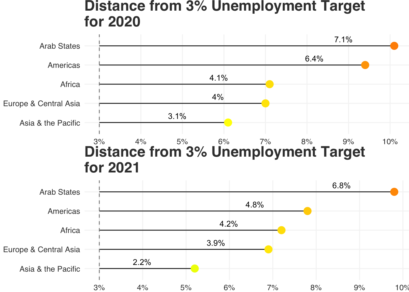
This visualization was inspired by the United Nations Statistics Division (UNSD) target unemployment rate of 3%. The x-axis shows the years, and the y-axis displays the regions. The ‘distance’ metric is calculated by subtracting 3% from each region’s unemployment rate, identifying how far each region is from the target. The years 2020 and 2021 were selected due to a curiosity of the impact that COVID-19 had on the global labor markets. In 2020, all regions had a greater distance from the 3% target compared to 2021, suggesting a recovery in labor markets following the pandemic.
unenployment_countries |>
  drop_na(unemployment_rate) |>
  mutate(region = recode_regions(region)) |>
  ggplot(aes(x = year, y = unemployment_rate)) +
  geom_line(aes(group = country), alpha = .25) +
  geom_smooth(color = "blue", method = 'loess', formula = 'y ~ x', se = FALSE) +
  facet_wrap(~region) +
  geom_hline(yintercept = 0.03, linetype = "dashed", color = "green") +
  scale_x_continuous(breaks=seq(2014, 2024, 2)) +
  scale_y_continuous(labels = label_percent(scale = 1)) +
  theme_fivethirtyeight() +
  theme(panel.spacing = unit(1.25, "lines"),
        panel.background = element_rect(fill = NA),
        plot.background = element_rect(fill = NA),
        plot.margin = margin(0, 0, 0, 0),
        axis.text.x = element_text(size = 9),
        axis.text.y = element_text(size = 9),
        panel.grid.major = element_line(color = "grey96")) +
  labs(title = "Unemployment Rate of Countries by Region
for years 2014-2024",
subtitle = "Grey: Individual countries | Blue: Smoothed trend | Dashed green: 3% target") 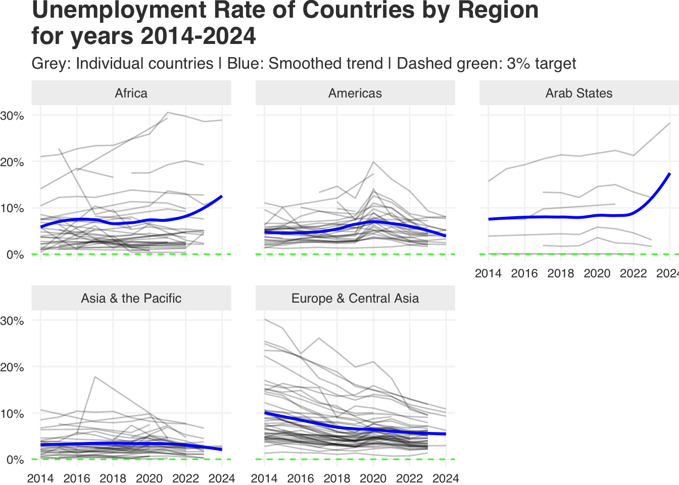
I wanted to look at the unemployment rate trends from 2014 to 2024 across the regions using a line chart. The underlying data was created by joining five regional datasets, each containing unemployment rates broken down by country, sex, and age. All genders were included, and the age group 25 and older was selected to better reflect the core working-age population.
From the original graph, it is unknown that the regions are represented this way:
- Europe & Central Asia: 51 countries, with a total population of more than 900 million.
- Asia & the Pacific: 36 countries, with a total population of more than 3.7 billion.
- Arab States: 12 countries and territories, with a total population of more than 122 million.
- Americas: 30 countries and territories, with a total population of more than 815 million.
- Africa: 54 countries, with a total population of more than 840 million.
This approach allows us to estimate how many countries are represented in each region, as each grey line corresponds to a specific country. More importantly, it shifts the viewer’s focus toward how unemployment rates have changed over time within countries, rather than directly comparing across regions, especially since we did not have a fixed list of countries per region. The smoothed blue line highlights overall regional trends, while the green dashed line marks the 3% unemployment target set by UNSD. The countries of Europe and Central Asia have steadily declining unemployment rates. The overall trends of unemployment are constant or steadily declining, there is an apparent lack of data for countries from all regions after the year of 2022 with the individual grey lines stopping.